Google Infographic
The first attempt as a work in progress...
|

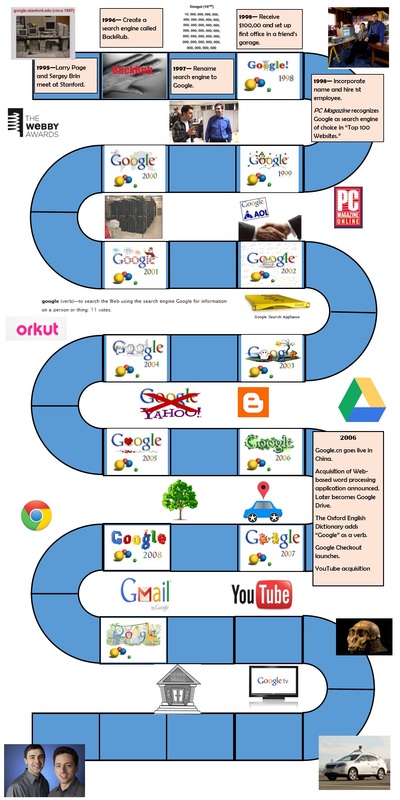
The final copy...
|
This project was very challenging, and I learned a great deal in the process. Fortunately, I was able to work with a very talented partner, Steven Rodriguez.
Purpose, Subject, and Audience
The purpose was to create a complex informational graphic, or infographic. One of the first challenges we faced was choosing subject matter. We researched various examples and ideas, but it was Steven who suggested that we tell the story of Google as it is such an interesting one. We determined that we wanted to focus on a general audience, and we wanted to make the graphic informational as well as fun and different. Unfortunately, I do not think that either one of us realized just what a big task we were undertaking or the wealth of information we would have to sift through. In other words, this project quickly overwhelmed us, and I feel we learned a valuable lesson after completing it.
Design Choices
Steven and I thought it would be fun and creative to use a board game design for the timeline (imagine Candy Land). We wanted our readers to follow a chronological path of Google's history, so we designed the infographic to follow a narrative structure. We incorporated the color scheme from Google's logo into the timeline and used it to represent different years. We kept the colors semantically consistent in order follow a pattern that encouraged the reader to predict what to expect. We also included other design elements that would signal the direction and shift in information such as arrows and sign posts, small multiples in the repetition of the boxes that form the path, and call outs for exciting statistics. We enclosed the text in the boxes and placed the graphics outside the path to encourage the reader to follow the flow of the timeline.
Our ultimate goal was to tell the story with both pictures and text. Nevertheless, we did not include any pictures that one could not find a reference to on the path, and we did not include a picture for every piece of information to avoid clutter.
Problems and Obstacles
Steven and I encountered various problems during this project. First, we had underestimated the amount of time we would need to research information and design the document. Additionally, we had difficulty visualizing the layout. Our first attempt (drafts 1-6) was not working well, so we started again with a new design. (You can see the difference between the two designs below.) To complicate matters, we were using programs with which we were unfamiliar.
This created a different set of problems in the technical aspects of the format such as the document becoming too large and difficulty moving images, text boxes, and other layers. For the final draft, Kendra had to save the document as a PNG file so that she could crop and re-size it before saving the final document as a PDF. Then she uploaded it into Microsoft Paint and cropped it. Finally, she printed the image from Paint as a PDF file. This was a tedious work-around to something that we might have been able to fix had we more time and experience.
Although we received great feedback from the instructor, I did not revise this document. If I were to improve it, I think I would start over with a different layout. For example, I would consider changing the orientation of the timeline from vertical to horizontal. I would incorporate many other changes as well and devote more time to the planning stage, thinking through how I would implement the design before it becomes too complicated or overwhelming.
