Brochure for a Client
Inside 2 Back Front
|
Inside 1 Inside 3 Inside 4
|
Purpose, Subject, and Audience
I interviewed my client, the director of the Academic Success Center (ASC) at Seminole State College (SSC), to define her needs and determine the intended audience for the final product. We agreed that I would create an informational brochure that provides information regarding the services and resources that the ASC offers to clients. The primary audience for this document is the students currently enrolled in classes at SSC. However, SSC faculty and staff, community members, and prospective students may view the document as well.
Design Choices
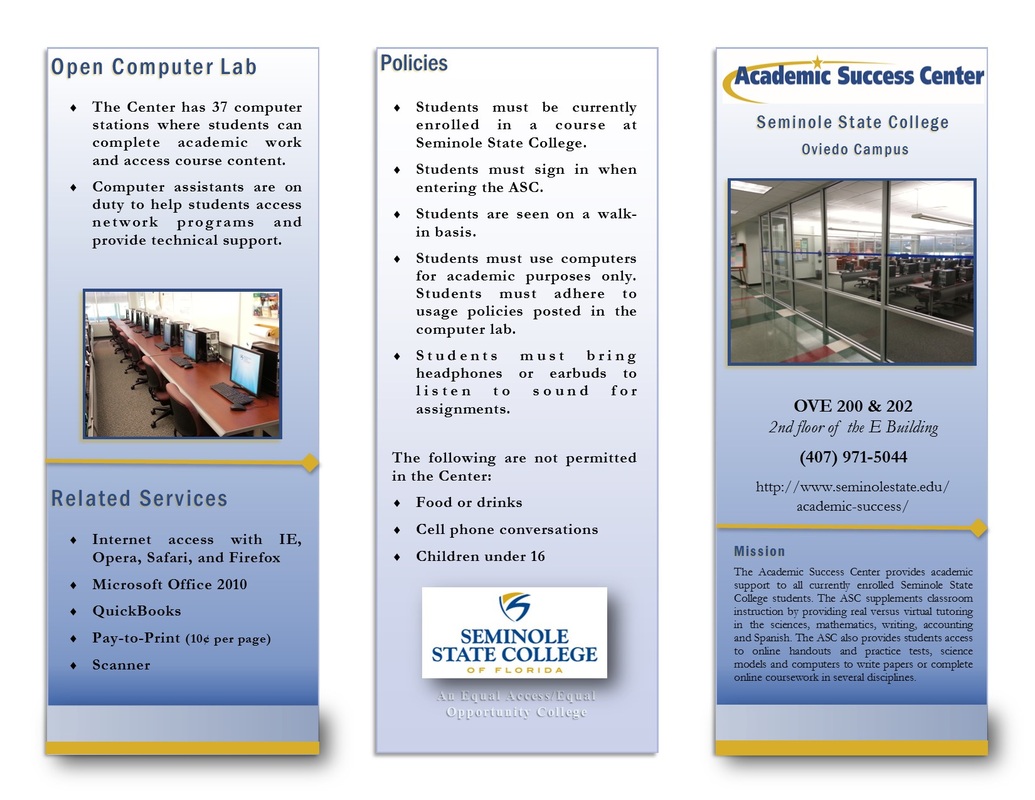
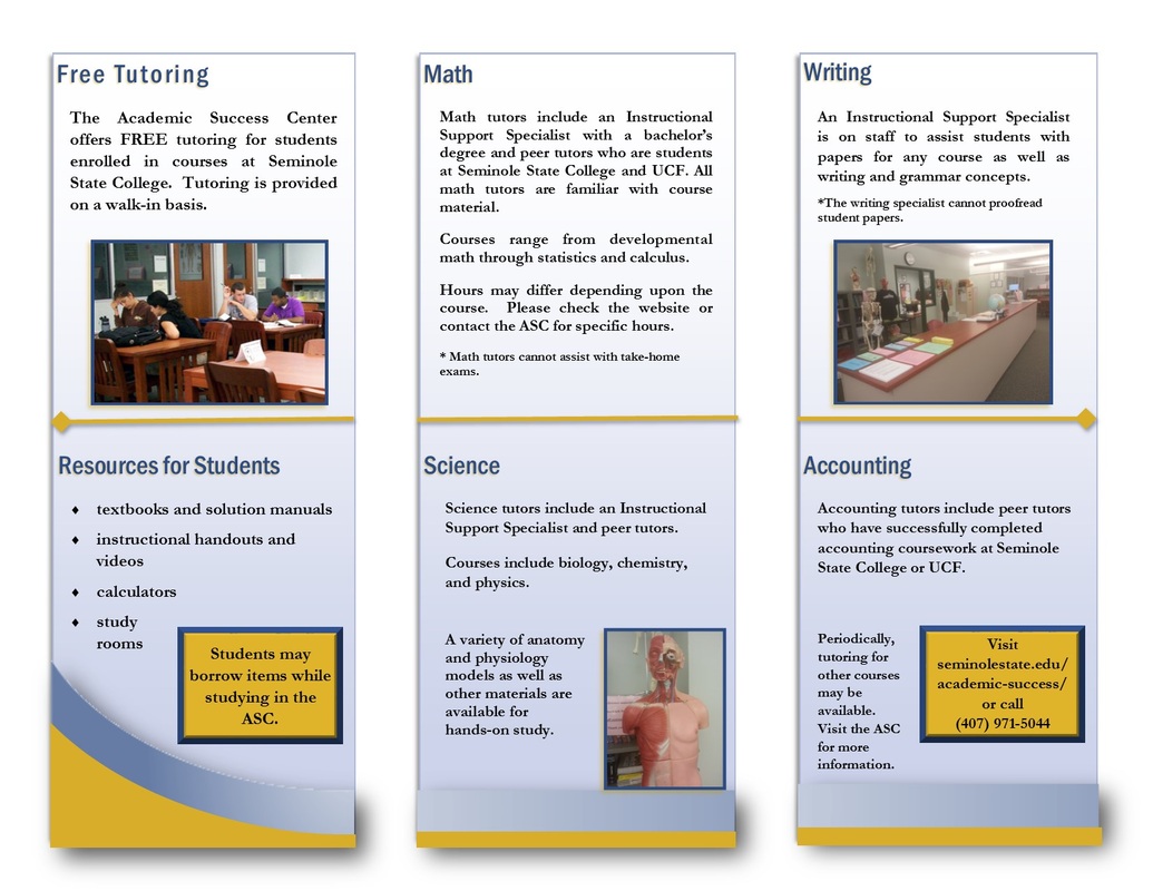
I wanted to establish a professional ethos that is suitable for an academic environment, so I chose a three panel C-fold leaflet. I used the colors from the school logo for the headings and shapes in the document. To give the panels depth, I chose a blue background with a gradient fill and a drop shadow. I chose images such as the ASC logo and a large picture of the outside of the center in order to establish the purpose of the document. I added other visual elements such as horizontal lines, diamonds, and banners at the bottom of each panel. On the inside panels I placed photographs that represent some of the information on each. I also included a couple of call-outs with important details. I enclosed all of the pictures in a blue frame to give the panels dimension. Finally, on the back panel I placed the Seminole State College logo. I used bulleted lists for related information that would be too dense in paragraph.
I interviewed my client, the director of the Academic Success Center (ASC) at Seminole State College (SSC), to define her needs and determine the intended audience for the final product. We agreed that I would create an informational brochure that provides information regarding the services and resources that the ASC offers to clients. The primary audience for this document is the students currently enrolled in classes at SSC. However, SSC faculty and staff, community members, and prospective students may view the document as well.
Design Choices
I wanted to establish a professional ethos that is suitable for an academic environment, so I chose a three panel C-fold leaflet. I used the colors from the school logo for the headings and shapes in the document. To give the panels depth, I chose a blue background with a gradient fill and a drop shadow. I chose images such as the ASC logo and a large picture of the outside of the center in order to establish the purpose of the document. I added other visual elements such as horizontal lines, diamonds, and banners at the bottom of each panel. On the inside panels I placed photographs that represent some of the information on each. I also included a couple of call-outs with important details. I enclosed all of the pictures in a blue frame to give the panels dimension. Finally, on the back panel I placed the Seminole State College logo. I used bulleted lists for related information that would be too dense in paragraph.
