Brochure
Inside 1 Back Front
|
Inside 2 Inside 3 (foldout map)
|
This project was a group effort to design an event program or brochure. I had the good fortune to work with two creative and talented individuals, Kayla Clark and Michael Rogers. (Click on the link to view their portfolios.)
Purpose, Subject, and Audience
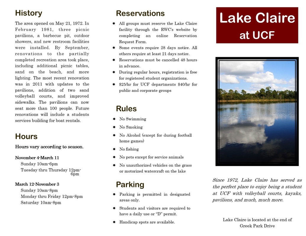
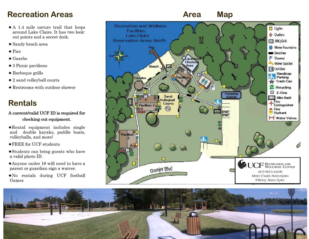
The project's purpose was to apply basic design principles to a brochure. Our team chose to create a brochure that would inform the UCF community about Lake Claire, a natural area that offers some recreational facilities and amenities. While researching the topic, we found that someone interested in visiting Lake Claire would have to search several different websites to find information, and even then it was incomplete. Our goal was to provide users with a document that would include all relevant information in a professional format that has a high level of usability.
Design Choices
We chose a 3-panel c-fold leaflet as it is the most convenient size that could accommodate he graphics and content we felt were important. We used Century for the base text as it is a serif font that looks professional and the letters are open, allowing for quick recognition. We chose Arial Rounded MT Bold for the headings as it is a contemporary, sans-serif font with rounded curves that would stand out but still work well with the base font. We selected earthy brown tones in order to emphasize the natural aspect of the setting, and we included photos that would give a sense of the natural beauty of Lake Claire while still allowing the user to see an overview of the area. Finally we laid out the panels in an order that we felt would be most attractive to the user, beginning with a beautiful cover picture and ending with the rules for using the area.
Final Drafts after Revisions
After receiving feedback, I made revisions to the original brochure pictured above. You can also see a description of revisions from previous drafts.
Purpose, Subject, and Audience
The project's purpose was to apply basic design principles to a brochure. Our team chose to create a brochure that would inform the UCF community about Lake Claire, a natural area that offers some recreational facilities and amenities. While researching the topic, we found that someone interested in visiting Lake Claire would have to search several different websites to find information, and even then it was incomplete. Our goal was to provide users with a document that would include all relevant information in a professional format that has a high level of usability.
Design Choices
We chose a 3-panel c-fold leaflet as it is the most convenient size that could accommodate he graphics and content we felt were important. We used Century for the base text as it is a serif font that looks professional and the letters are open, allowing for quick recognition. We chose Arial Rounded MT Bold for the headings as it is a contemporary, sans-serif font with rounded curves that would stand out but still work well with the base font. We selected earthy brown tones in order to emphasize the natural aspect of the setting, and we included photos that would give a sense of the natural beauty of Lake Claire while still allowing the user to see an overview of the area. Finally we laid out the panels in an order that we felt would be most attractive to the user, beginning with a beautiful cover picture and ending with the rules for using the area.
Final Drafts after Revisions
After receiving feedback, I made revisions to the original brochure pictured above. You can also see a description of revisions from previous drafts.
Revisions
- made bullets consistent for each area
- aligned headings to the left
- used full justify for text boxes
- moved and resized text so that everything fit onto the panel
- moved the 3-panel photo to the bottom of the document beneath the map and text
- adjusted the title over the map area so that it fits across panels
